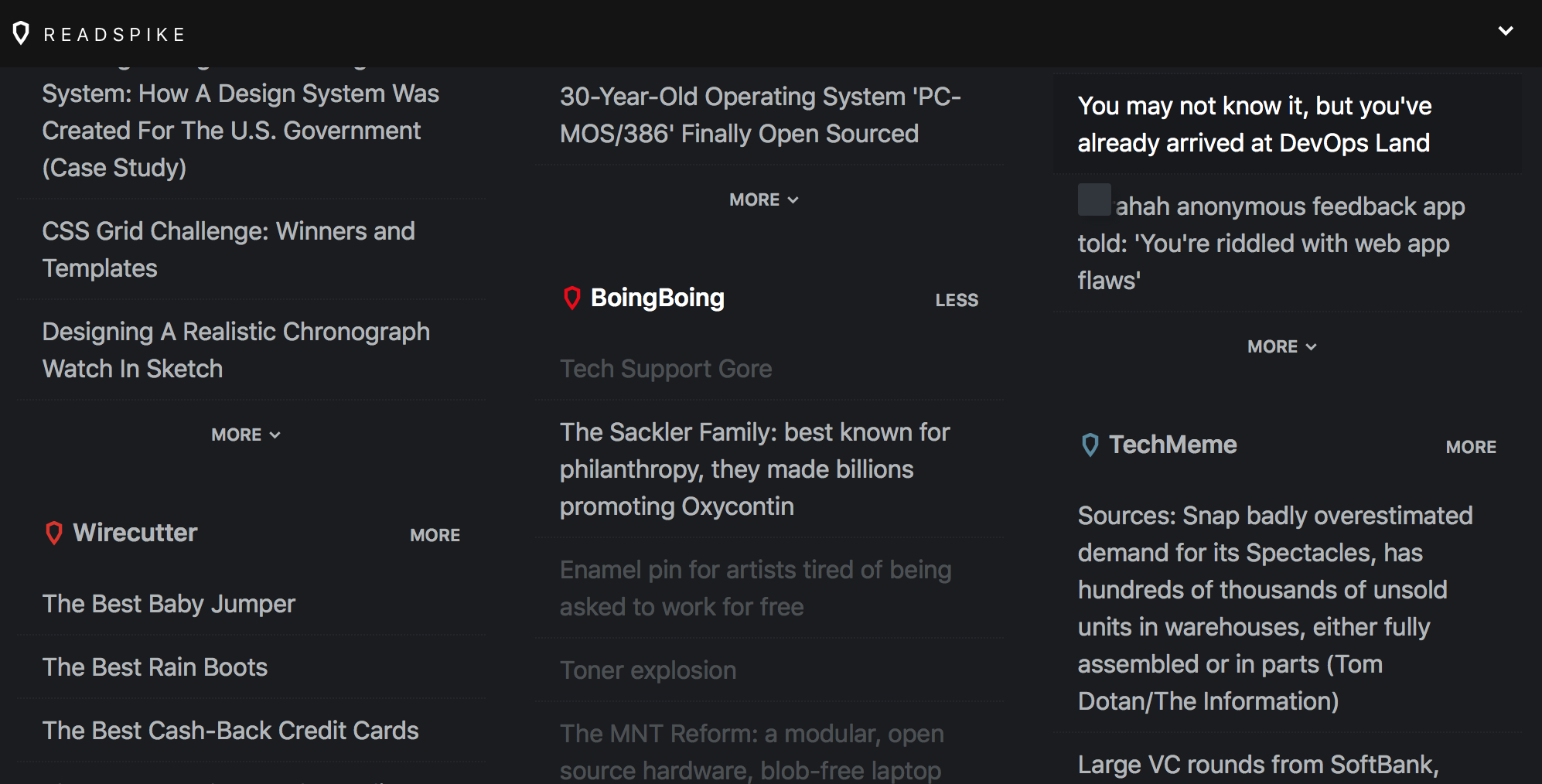
Readspike is a simple news aggregator: just the headlines, with no social networking or other bullshit getting in the way. It's by Blackspike, a British design agency.
The best yet in its class, beautiful and simple, with a good taste in sources. But I find something about it hard to read. It might be too beautiful, if you see what I mean? News aggregation is a complex design problem. Multiple columns, in particular, serve a different god.
People often say this sort of site is like RSS without all the things that make RSS useful, but I think it's like RSS without all the things that make RSS painful. The next step here, though, would surely be the ability to pick your sources.


