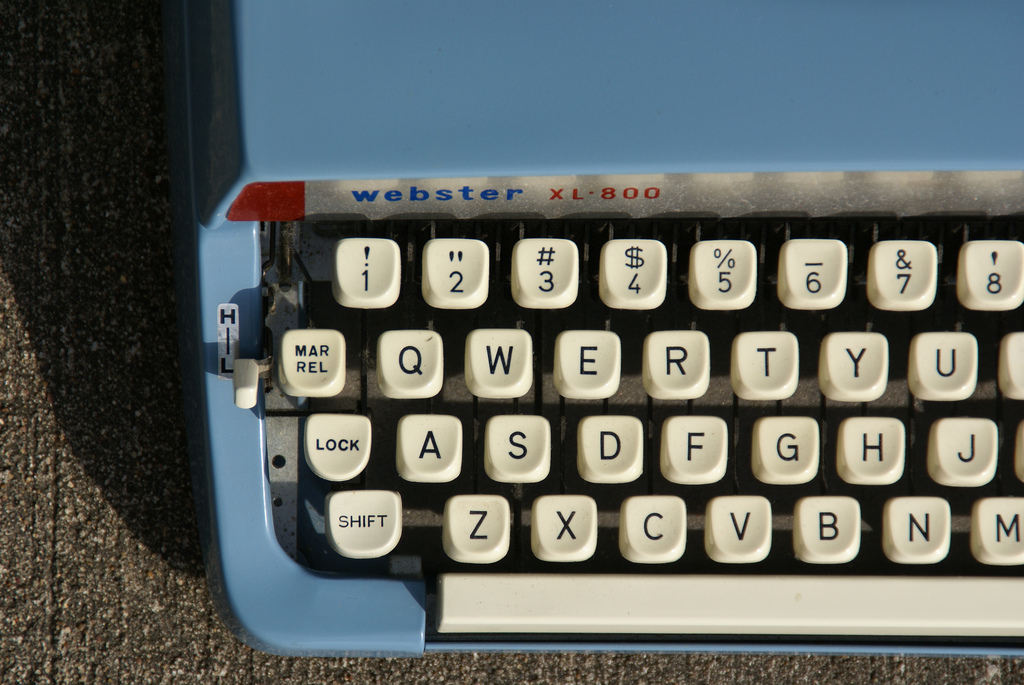
Amongst people who care deeply about typography and fonts -- which is, in our typographic age, probably a reasonable chunk of people online -- there's been a low-level war about spacing after a period. Specifically: When you finish a sentence, do you type one space, or two?
There are many heated views on this matter.
But recently, a couple of scholars decided to science this one out, and ... things did not turn out well for the one-spacers.
As the Washington Post reports:
So the researchers, Rebecca L. Johnson, Becky Bui and Lindsay L. Schmitt, rounded up 60 students and some eye tracking equipment, and set out to heal the divide.First, they put the students in front of computers and dictated a short paragraph, to see how many spaces they naturally used. Turns out, 21 of the 60 were “two-spacers, ” and the rest typed with close-spaced sentences that would have horrified the Founding Fathers.
The researchers then clamped each student's head into place, and used an Eyelink 1000 to record where they looked as they silently read 20 paragraphs. The paragraphs were written in various styles: one-spaced, two-spaced, and strange combinations like two spaces after commas, but only one after periods. And vice versa, too.
And the verdict was: two spaces after the period is better. It makes reading slightly easier.
Mind you, the reading-speed improvement with double spaces was only 3%, so we're talking about a pretty tiny delta here.
Small enough, in fact, that this study has not so much resolved this debate as fanned its eternal, eldritch flames. Over a Lifehacker, Nick Douglas notes that the study didn't really model the type of reading people do all day long: The text was typed out in a monospaced font with double-spaced lines, whereas the majority of reading we do online (and in print) is with proportional fonts, and rarely double-spaced. Meanwhile, Matthew Butterick wrote -- in a proportional font, bien sur -- a terrific essay looking at these questions from the perspective of typographers.
Me, I'm a one-spacer. When I cut and pasted the text from the Washington Post into this blog post, I immediately noticed that the Post writers had composed their story using two-spaces, those sly dogs. (In a wonderfully meta turn of events, the reason I was able to notice this is that the "text" editing format in Wordpress, the CMS in which we write these Boing Boing posts, itself uses a monospace font. So maybe monospace isn't quite as dead, for composition, as one might think!)
Anyway, the instant I saw the double-spacing, I aesthetically recoiled. Like any normal person would. So I dumped the text into Clean Text, a little Mac app I keep open all day long while I'm at work, because it's great for quickly cleaning up the wonky formatting of text cut-and-pasted off the web. It's even got a preset command for "Fix spaces", which of course means "take all double spaces, which are an affront to all right-thinking citizens of good conscience and discernment, and replace 'em with single spaces".
And I hit it.
(CC-licensed photo via J E Theriot)


