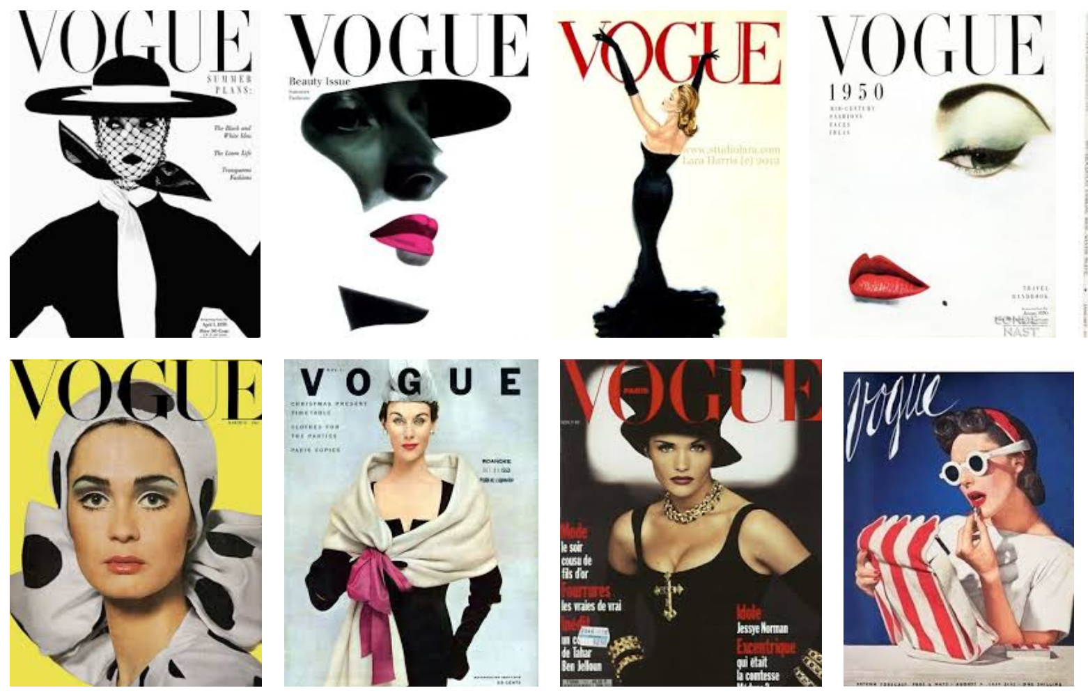
Condé Nast has made some bad bets. It pulled the plug last year on its attempt at an online fashion retail site, Style.com, after nine months of development and an investment of more than $100 million.
$100 million! On one website!
MIRANDA
All those links look exactly the same to me. Red is fine. You know, I'm still learning about all this stuff and, uh...
WEB NERD (shouty)
THIS STUFF? OH OK. I SEE. YOU THINK THIS HAS NOTHING TO DO WITH YOU. YOU LOOK AT THE COLOR PICKER AND YOU SELECT OHHHHHH I DON'T KNOOOW "RED" BECASUE YOU WANT TO LOOK CLASSY AND YOU DON'T WANT BLUE LIKE A PLEB WEBSITE BUT IT'S NOT RED IT'S #A60505 AND YOU'RE (shrieking now) BLITHELY UNAWARE OF THE FACT THAT IN 2009 CSS ZENGARDEN FEATURED A RENAISSANCE-INSPIRED LAYOUT AND THEN IN 2010 BOING BOING, YES IT WAS BOING BOING, REDESIGNED WITH IT AS THE STANDARD ANCHOR TAG COLOR, AND THEN IT SHOWED UP IN THE STYLESHEETS OF EIGHT DIFFERENT FACEBOOK CHUM FARMS AND THEN IT FILTERED DOWN THROUGH THE (screaming uncontrollably) TRAGIC FREE TUMBLR THEMES UNTIL YOU PICKED IT OUT FROM A MATTE INKJET PRINTOUT. THAT RED REPRESENTS MILLIONS OF BLOG POSTS AND COUNTLESS CLICKS AND (breathless croaking) it's sort of comical how you think you've made a choice that exempts you from the fashion industry when in fact you're wearing the CSS that was selected for you 10 years ago.
MIRANDA
You're fired.


